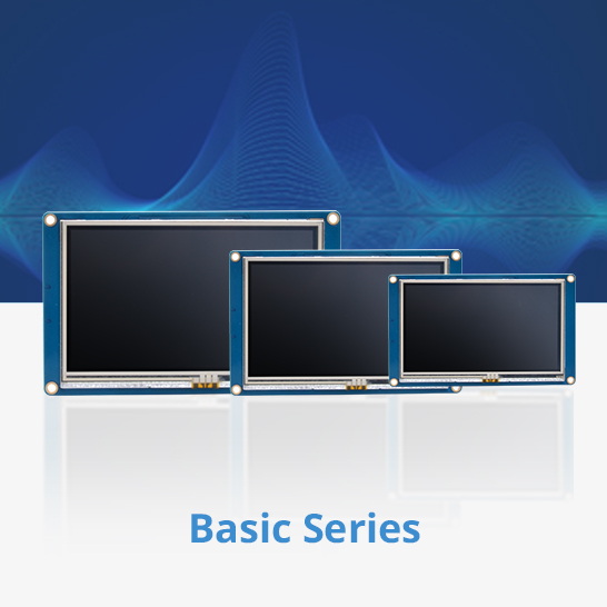
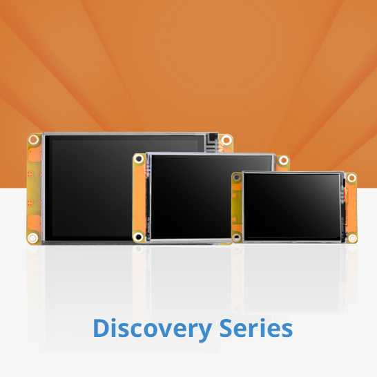
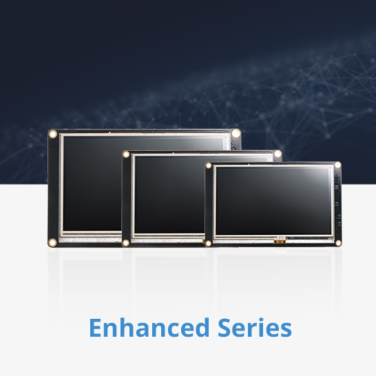

 Accessories
 Designing a round UI for Nextion HMI – step by step Leave a comment
Designing a round UI for Nextion HMI – step by step

You have most probably read last week’s blog which was a teaser for the upcoming new Edge Series which comprises among others two round HMI screens. After I showed you how to extend a Gauge component with a few lines of code to get a 360° round touch control here, here, and here, it’s time to talk about round (or even rounded on a rectangular screen) UIs. Since it does not look like we will get round or bent Number or Text components soon, we’ll have to think more of integrating static elements in the page’s or component’s background picture to create nice, ergonomic and appealing interfaces. Another advantage of packing as much as possible statically into the page background is saving on memory and system resources. Simple pixel graphic tools like MS Paint won’t be helpful for this – and a complex vector graphics program like Adobe InDesign or the now defunct Corel Draw are a total overkill on the other side. So, let’s go with something in-between: Adobe PhotoShop, its free open-source alternative The Gimp, or any other pixel graphics tool which can handle guide lines, layers and paths will do the job. For today’s step-by-step example, I used The Gimp v3.0.4 which is available for free for Windows, Mac and Linux. The steps are pretty similar on the other aforementioned tools, so, whatever you prefer, you’ll get a nice result.
Part 1: Designing a watch face
Before we start drawing and painting, we need to think about some specifications: Our picture shall have a format of 480 x 480 pixels to fit the NX4848E021 or the NX4848E028 HMIs. We want to leave 20px around the watch face free for optional round text, so, the outer radius for the hour marks is 220px. The main marks at 12, 3, 6, and 9 shall have a length of 20% which makes their inner radius 80% of 220 px = 176px. The secondary marks at 1, 2, 4, 5, 7, 8, 10, and 11 need only to be 15% from which we calculate their inner radius to 85% of 220px = 187px. These numbers will help us setting up the guide lines for the round selections, later.
Before we start drawing, we need more guide lines: For the primary hour marks a vertical and a horizontal guide line through the center of the image, at 240px. For the secondary hour marks, which are all +- 30° apart from the primary marks, we need horizontal and vertical guide lines at 240 x (1 +- tan(30°)), which is at 101 and at 379 px. Now, with this, lets start:
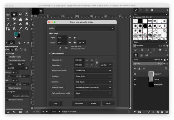
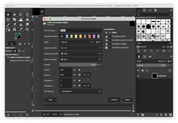
Step 1: Create a new image
Select the size to 480 x 480 px, RGB encoding and 8bit integer precision which is more than enough for the Sextons 16bit RGB-565 color space:
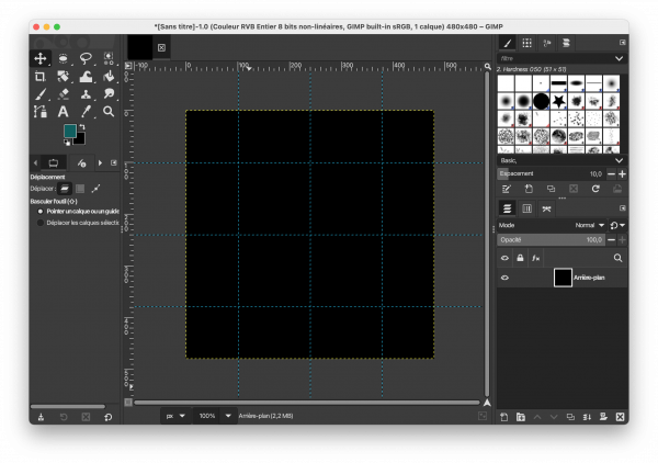
Step 2: Position all the required guide lines
Now, with the move tool, add the guide lines required for the primary and secondary hour marks, horizontally and vertically at 101, 240, and 379 px:
Add the guide lines for the outer circle horizontally and vertically at 20 and 460 px:
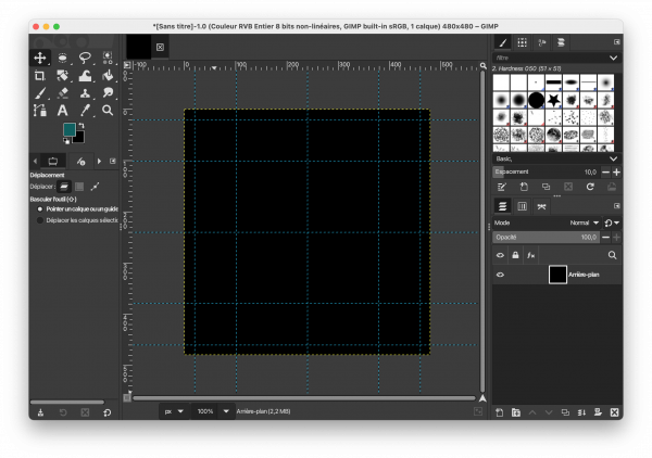
Add the guide lines for the two inner circles horizontally and vertically at 53, 64, 416, and 427 px:
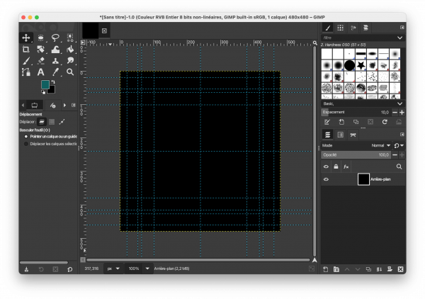
Now with all that guides (and guidance), we can finally start drawing!
Step 3: Add a transparent layer for the primary hour marks above the background
Never draw directly on the background, use preferably different layers for different kinds of elements, so that the ones won’t interfere with the others:
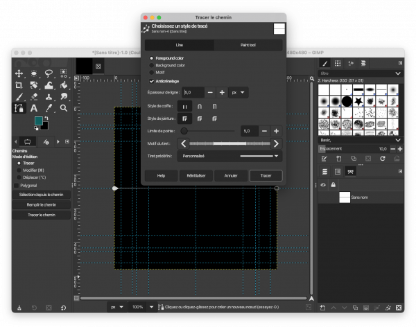
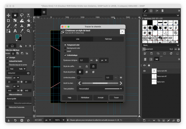
Step 4: Draw paths, color and cut them
Now, to draw lines, we will first define paths (which are invisible contours) and color them afterwards. For the 3 and 9 marks, we create a path along the horizontal guide at 240px and then, we color it with a 5px thick line:
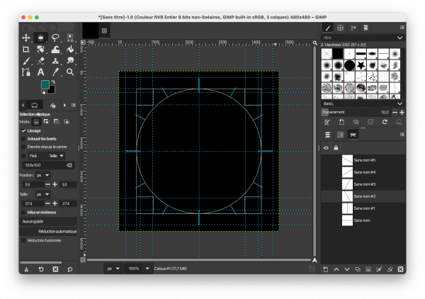
Then, we do exactly the same along the vertical 240px line for the 12 and 6 marks. Since this gave us two solid crossed lines over the whole picture, we need to cut some things out. First, we use the 20 and 460px guides to create a round selection, then we invert the selection (to select everything outside) and we simple cut everything outside:
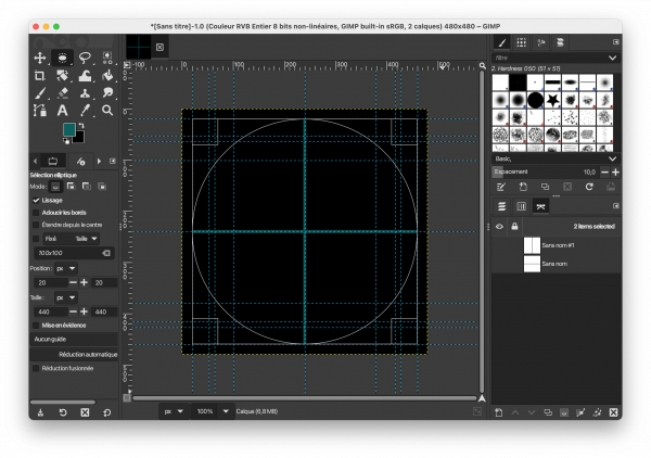
And now, you guessed it, we use the 64 and 416px guides to make a new selection, this time without inverting it since we want to cut everything inside, and we are done with the primary marks.
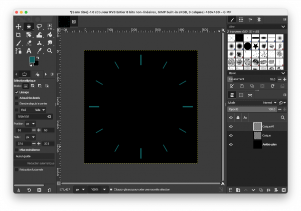
Step 5: Add another transparent layer for the secondary hour marks, draw, color, and cut the diagonal paths
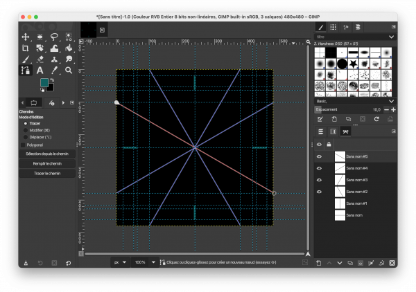
This time, to make them finer than the primary marks, we’ll use 3px thick lines:
Again, we use the 20 and 460px guides to create a round selection, then we invert the selection (to select everything outside) and we simple cut everything outside. Afterwards, we use the 53 and 427px guid lines for another round selection (without inverting it!) and we cut the inside:
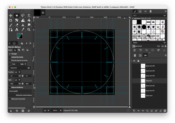
De-selecting everything and hiding temporarily the guide lines shows us the result, which we could already export as a png and use in the Nextion Editor:
Part 2: Add some text around
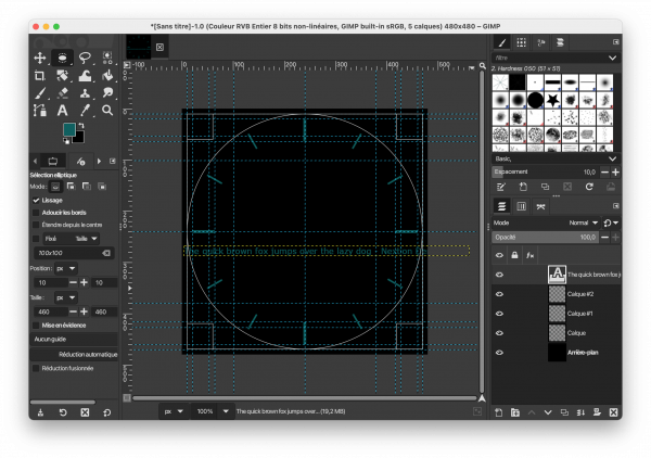
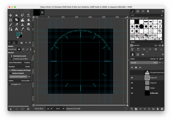
If we want to have text bent around a form, we need to create a path for it, first. And still before, we need to add another transparent layer. It is important to create the circular text on a separate layer because we’ll need to rotate it afterwards. To create a path for the round text, we’ll need to add another 4 guide lines in the middle of the free space around the clock face, thus horizontally and vertically at 10 and 470px. These allow us now to make a round selection and to transform the selection into a path:
Now, with the text tool, we create a (floating by default, but that’s not important here) layer where we can temporarily write our text. Select a lean font like MS Sans Serif in 14px size and put for example “The quick brown fox jumps over the lazy dog – Nextion Demo by Thf July 2025” (or whatever…):
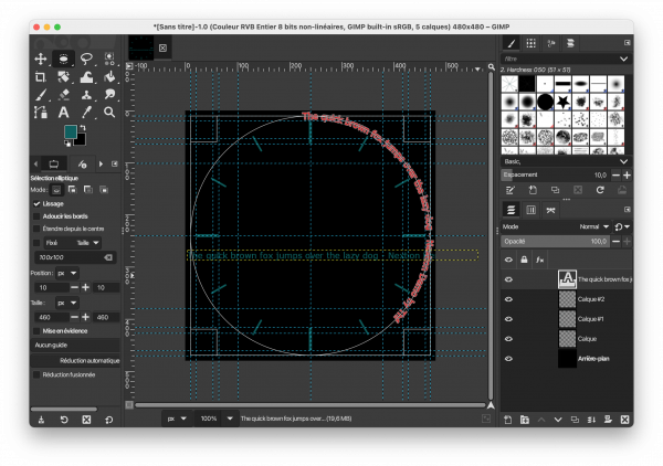
Then, use the “Text along a path” function to bend this text around the path which we created from the round selection. The result will be another path:
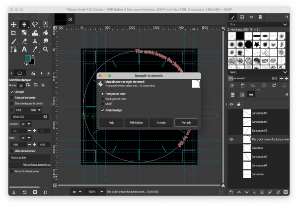
To make the bent text visible, we need to fill that path with the foreground color:
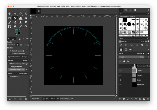
Since Gimp starts drawing the text at 12 o’clock, we need now to rotate the layer by approximately -66° (Ctrl-Z is your friend when you want to go back and try again with a slightly different angle…):
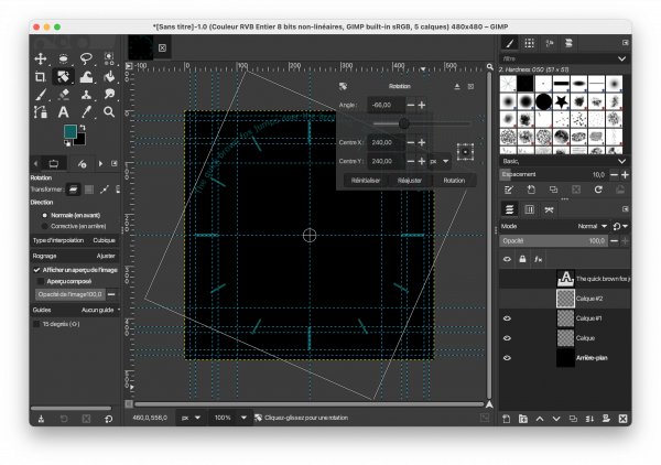
Due to the rotation, this layer has grown beyond the borders of the image (look at the yellow lines), and we need to use the “Layer to image dimensions” function to clean this up:
And we have the final result which can be exported as a .png:
Isn’t that very complicated ?
It may look complicated, but with some practice, you may obtain professionally looking results. Thinking about everything beforehand and setting up the guide lines is the longest part. That’s why I allow to attach the Gimp project source file here, so that the basic work is already don, you may see how layers and paths are organized, play with it and modify it to taste: NexRoundDemo.xcf
Last, but not least
You have any questions, comments, critics, or suggestions? Just send me an email to thierry (at) itead (dot) cc! 🙂
And, by the way, if you like and you find useful what I write, and you are about to order Nextion stuff with Itead, please do so by clicking THIS REFERRAL LINK! To you, it won’t forcibly make a change for your order but on some products, you may even get a 10% discount using the coupon code THIERRYFRSONOFF. In ever case, it will pay me perhaps the one or the other beer or coffee. And that will motivate me to write still more interesting blogs 😉
Thank you for reading and happy Nextioning!